Graphic designer Kim Jackson serves as Asian American community rep to State Emblem Redesign | By Martha Vickery (Fall 2023)

Kim Jackson, a Twin Cities graphic designer who supports Asian American community organizations with her work, was recently appointed to a state governmental commission that’s on a mission – and that mission has a hard deadline.
Jackson, a lifelong Minnesotan and Korean adoptee (and a self-described flag nerd) was the pick of the Council on Asian Pacific Minnesotans (CAPM) to the State Emblem Redesign Commission (SERC) which has been charged with coming up with both a new state flag and a new state seal.
Thirteen members have been appointed – two are from the Minnesota Indian Affairs Council, and one each from African American, Asian American and Latino American communities. There are also appointees from departments of the state (Capitol Area Architectural and Planning Board (CAAPB), Explore Minnesota tourism board, the State Arts Board, and Secretary of State Steve Simon). There are also four (non-voting) members of the legislature, including Rep. Mike Freiberg, one of the authors of the legislation establishing the commission.
The mission is to re-vamp both Minnesota’s state flag and its state seal. To be successful, the mission needs the contributions of many Minnesotans. The Commission is now gathering entries for flag designs, submitted by anyone (not only Minnesotans), and posted on a dedicated website, under the project name Minnesotans for a Better Flag.
Entry submission instructions and a link for submitting are on the website of the Minnesota Historical Society. Non-Minnesotans have an additional requirement to explain on their application their personal connection with the state.
The Commission chair is Luis Fitch (appointee of the Council on Latino Affairs), who Jackson said has worked on many large national and global projects through his St. Paul business UNO Branding. The vice-chair is Anita Gaul (an at-large Governor’s appointee), a historian and educator.
So far, the Commission’s meetings have been virtual. “It has been exciting, it has been thrilling, it has been intense,” she said. “I am in a virtual room with incredibly smart, passionate people who all want the same thing – to get together and make this happen in the time frame we are all facing together.” Jackson calls it “an honorable responsibility” to serve as the Asian American community voice on the historic commission.

Jackson explained that some of the design examples on the “Notable Designs” page of the website were invented years ago. Some were submitted originally for past contests held by newspapers around the state, and some were resubmitted for the current Commission’s consideration. As of mid-October, she said, there were upwards of 800 flag submissions and more than 70 seal submissions.

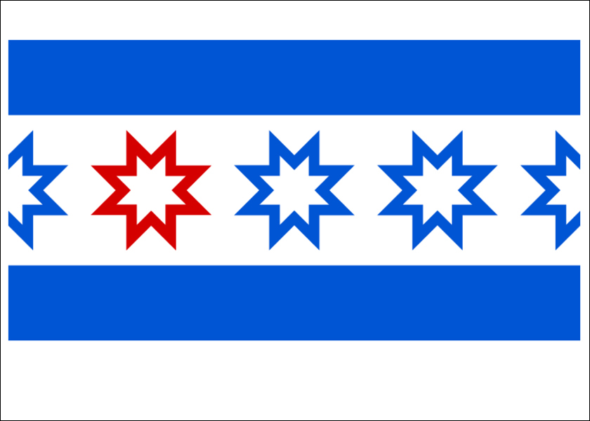
Some interesting common patterns emerge from among the “Notable Designs” web page, including the North Star (which sometimes looks like a compass symbol), the night sky, loons, water, and many shades of blue and green.
The deadline for flag and seal entries is October 30. After that, the Commission will compare and analyze the designs to come up with a final recommendation. The Commission’s design decision will be delivered in a report to Governor Tim Walz on January 1, 2024. Then in May 2024, the new state symbols will become official.
The state emblem redesign idea is not a new one. A similar 2002 commission produced a lot of entries but no official change in the flag. There has, however, been broad agreement that the present flag of the state violates one of the key principles of flag design – simplicity. It includes small figures and design elements that cannot be discerned from any distance, three dates, and a confusing amount of other details. Another fact pointed out on the website (with illustrations) is that more 20 other state flags consist of a state seal on a blue background.
The website also quotes Ted Kaye, of the North American Vexillological Association (vexillology is the study of flags) and author of Good Flag, Bad Flag, that a good flag, ideally, should have two or three colors, no words, meaningful symbolism, and a design that distinctive and memorable.
Aside from design elements, the flag has been widely criticized for the message it sends, with its settler plowing the land with an Indian on horseback who seems to be leaving Minnesota and riding west.
Jackson deals every day with the world of symbols, graphics, and how things look at first glance. Her experience with Asian American community organizations includes Korean Quarterly, which she co-founded as a non-profit organization in 1997, and for which she served as art director for more than 25 years. The symbol she created for KQ’s 25th anniversary and digital archive rollout was from an ancient Choson Dynasty naval flag.
Her experience also includes work for many Asian American organizations whose cultures she was much less familiar with. Recently, she helped an organization of Cambodian Minnesotans work with the Minnesota Humanities Center on the organization’s annual event. The program included a Khmer translation. Jackson said her work in Asian American community advocacy has educated her.

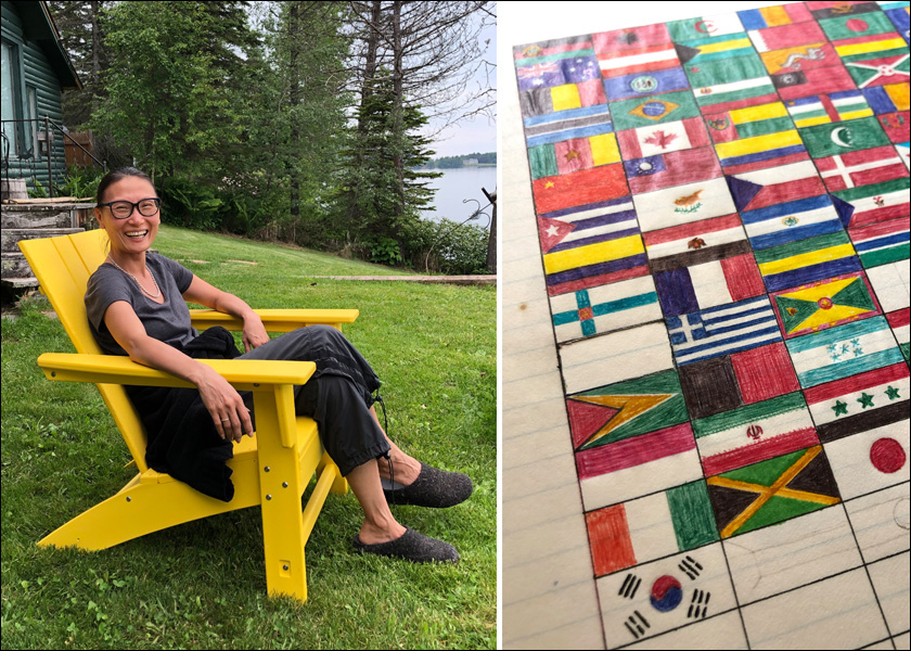
Jackson has been interested in flags since she started playing with graphic design as a teenager. “I am such a flag nerd. That is why I was so excited about the possibility of being on this commission,” she said. “On the back page of the encyclopedia, there were all the country flags of that time. I did flash cards of them so I could memorize the flags – I started quizzing myself.” Recently, she said, she came across an unfinished collage she had started in either high school or the beginning of college, about the flags of countries.
Studying flags, she noticed patterns emerging, “Like why do all the Scandinavian flags have crosses on them?” Her flag-nerdiness led her to put the tiny country of Andorra on her list of places to go during her first trip to Europe. “I was so intrigued by the flag but didn’t know anything about the country.”
As a member of the SERC, Jackson is learning more about the state flag. The Historical Society gave a helpful summary presentation to the new commission, she said. The presenters explained that the current flag design was adopted in 1957 and got some minor changes in 1983 – that is the flag we see today. The very first flag, an embroidered one, was flown for the first time in 1893.
There were also various versions of the state seal, none radically different from the first one, which was designed by Minnesota’s first governor, Henry Hastings Sibley. It premiered in 1858 when Minnesota adopted statehood. It includes many of the same elements as the flag, even depicting the St. Anthony Falls, seen as a driver of Minnesota industry.
The Historical Society, which is providing support for the SERC, has published some general guidelines on what can be depicted in the design of the new state flag. According to its website, “the designs must accurately and respectfully reflect Minnesota’s shared history, resources and diverse communities.” The website also notes that “Symbols, emblems, or likenesses that represent only a single community or person, regardless of whether real or stylized, may not be included in a design.”
Following these strict guidelines for both submitting design and for the Commission analyzing them “may seem like a big ask, but at the same time I think it helps to simplify the work,” Jackson said.
The Commission has been meeting virtually. Jackson said that the first in-person meeting will be held November 21, which will be open to the public and available virtually. The location is still to be determined, probably either at the Historical Society or the Capitol, Jackson said. More updates are to come on the Commission’s website and by email on the November in-person meeting. A second in-person meeting will follow in December.
Submission instructions and forms for flag or seal designs, and information about SERC ongoing meetings, are at this link. A brief history of the Minnesota flag and seal is at this link.


